Students will create a 5x5-inch clay tile in relief based on a personal story about an animal. The animal size must be bigger than 3.5 x 3.5 inches. The project focuses on using the sculptural techniques of addition (building up clay) and subtraction (carving away clay) to create a sense of depth and texture. The goal is for students to visually represent a memory or story, and to understand how these techniques create a three-dimensional effect.
Learning Objectives
Students will be able to define and explain the concepts of relief sculpture, addition, and subtraction in the context of clay.
Students will be able to plan a design based on a personal narrative.
Students will be able to successfully create a 5x5-inch clay tile using proper clay-handling techniques. The addition can be over 5x5 but within 6x6.
Students will be able to apply both additive and subtractive methods to create a textured relief surface.
Students will be able to glaze and finish their ceramic artwork for a final piece.


Animal Tile term A Gallery- Anumal Size is bigger than 3.5 x 3.5 inches


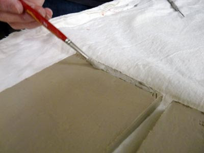
Relief Carving- Building pop-up and carving textures


 |


1. My Animal: What animal is your story about? Is it a pet, a wild animal, or a fictional creature?
2. Where does your animal live? Describe its home. Is it a cozy burrow, a vast ocean, or a bustling city?
3. What is your animal's big adventure or challenge? What is the main event happening in your story?
4. What is your animal doing in the tile? Is it hiding, searching, or celebrating? What moment are you capturing?
5. What is the mood of your story? Is it happy, mysterious, or a little sad? How will you show that feeling in your clay tile?
6. What specific memory or moment about this animal do you want to show on your tile? Describe the scene in a few sentences.
7. What quality does your animal represent? (For example, courage, cleverness, or kindness). How does your story show this quality?
8. What lesson or message is in your story? Is it about friendship, perseverance, or appreciating nature?
9. What is one thing you hope people will feel or think about when they see your tile?
Planning your Relief: Think about how you'll use addition (adding clay) and subtraction (carving).
1. What part of your design will you build up with addition? (For example, the animal itself, a tree, a ball, etc.)
2. What part of your design will you carve away with subtraction? (For example, the background, shadows, details like fur, etc.)
Use your sketchbook to sketch a plan:


1. Building up the slab